With Xoxzo's asset design update, we've been making many changes across the board, including to our blog. In fashion with our new design, we wanted to share with you what and why we changed.
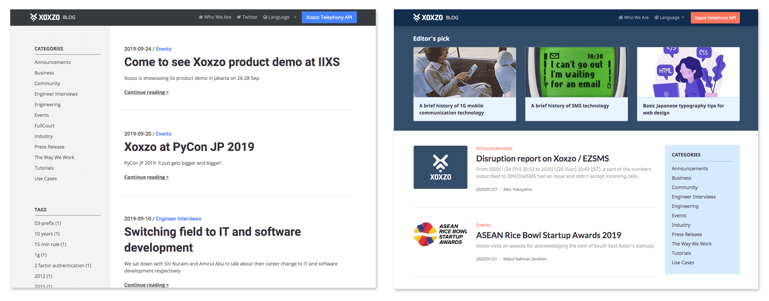
Added thumbnail to article list
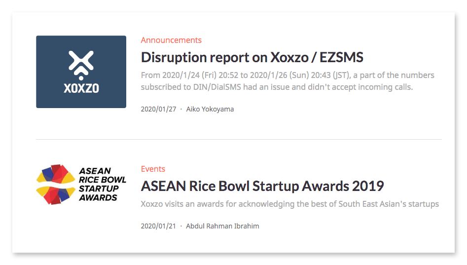
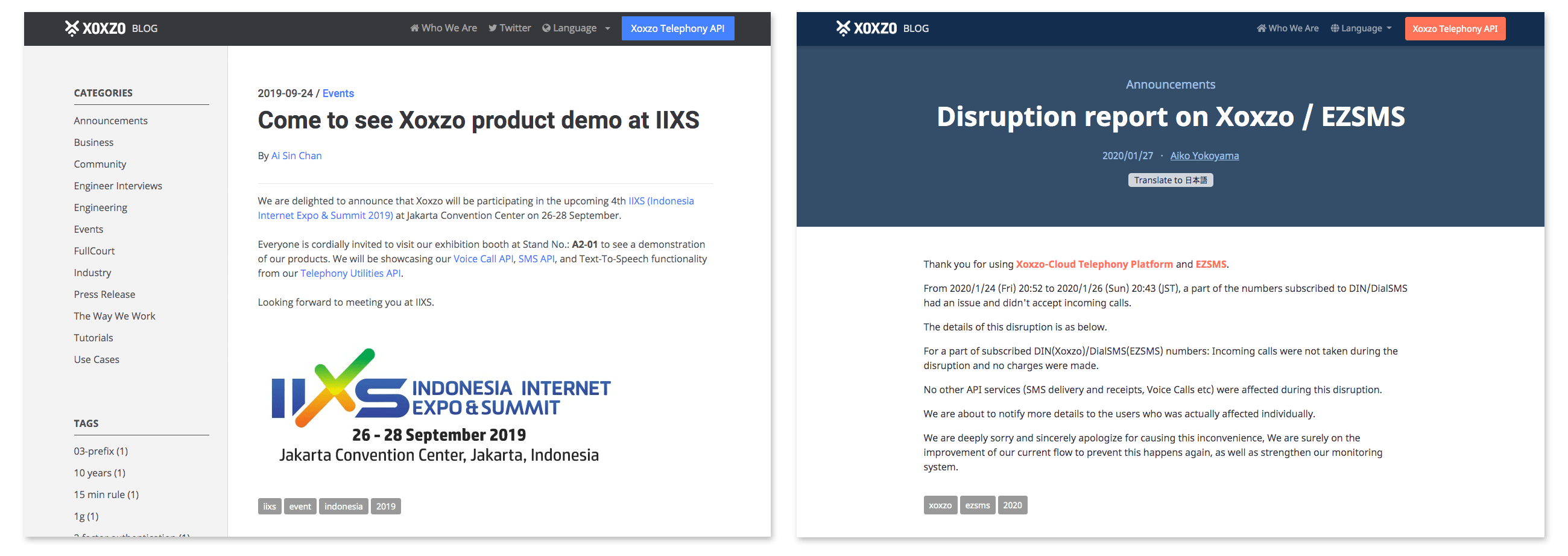
If you look at how the article list looked before, the layout was not visually easy to navigate and made the elements seem like they were blurred together. Because card layouts are quite intuitive, making clear distinctions between articles, we found this option helps us present our content cleanly, linked in an easy-to-understand way, while also allowing us to add image thumbnails.
We used pelican-advthumbnailer plugin to generate thumbnails easily.
1. Install plugin and update pelicanconf.py
$ pip install pelican-advthumbnailer
# pelicanconf.py
PLUGINS = [..., 'advthumbnailer']
2. Add Thumbnail metadata to your blog post
<!-- new_blog_content.md -->
Title: Xoxzo blog has a new look!
Date: 2020-02-10 13:00
Slug: xoxzo-blog-has-a-new-look
Lang: en
Author: Hyejeong Park
Thumbnail: images/blog_thumbnail.png
...
3. Put article.thumbnail in <img> tag and set image size. Also, don't forget to add a default thumbnail image.
<!-- index.html -->
<a href="{{ SITEURL }}/{{ article.url }}">
  {% if article.thumbnail %}
  <img src="{{ SITEURL }}/{{ article.thumbnail | thumbnail('350x_') }}">
  {% else %}
  <img src="{{ SITEURL }}/{{ THEME_STATIC_DIR }}/images/default_thumbnail.png">
  {% endif %}
</a>
You can learn more about pelican-advthumbnailer here.
In the same theme of intuitiveness, we changed the typography of the listed articles, added color to clearly indicate hierarchy, and adjusted the padding on the title and summary to create a more organic look.
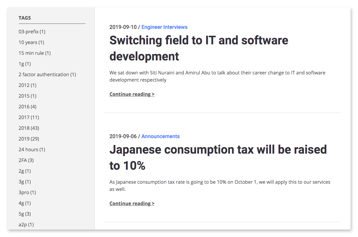
Removed tag list
Previously you may remember having a long list of tags on the left sidebar that made it take forever to scroll to the bottom of the page. While it was originally placed there to help users browse articles, functionally, it was not very useful. As a result, we decided to remove the tags list, leaving the category list, making the page easier on the eyes.
Changed article page template
In the previous version of the article page template, most elements besides the bolded article title were of similar size and color, making it less intuitive in distinguishing elements from each other. We wanted to reduce the friction users could have felt when browsing and make it easier to focus on the content.
To help with this with our new design, we gave the title and body content a clear contrast and gave the smaller elements, like author, date, and category an intuitive hierarchy. We also removed the sidebar, leaving the article to focus on.
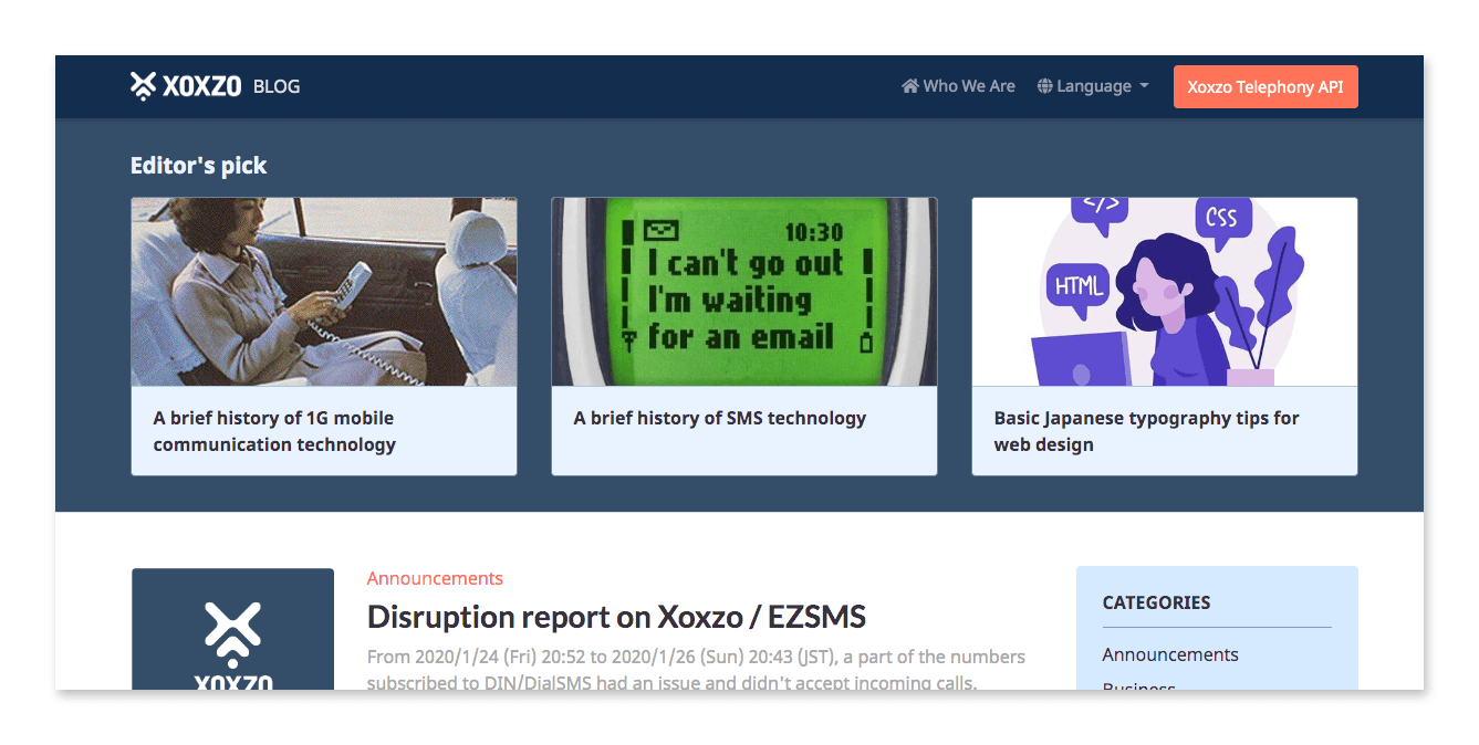
Added Editor's pick section
In order to leverage our best content and showcase it to users, we decided to create a "Featured" area on the blog. Unfortunately, we were not able to find a Pelican plugin for this, so it is not running dynamically, but we will be updating the section regularly!
Wrapping up
All of these improvements have been a long time coming, and thanks to our redesign, we're excited to finally bring you these changes. With them, we hope to create a more intuitive user experience for our readers to enjoy.
Hyejeong Park
User Experience
No longer with XoxzoJoined November 2016. Major in Visual Design at Seoul National University. Previously worked as an UI designer for iOS app. Interested in both design and web development. Loves beautiful UI, clean Web, and Python/Django.