Typography is important, as you can find it everywhere. Typography is the art and technique of arranging type to make written language legible, readable, and appealing when displayed. The arrangement of type involves selecting typefaces, point sizes, line lengths, line-spacing, and letter-spacing, and adjusting the space between pairs of letters.1
Because Xoxzo supports our service both in English and Japanese, I need to take care of the typography of each language. As a non-Japanese reader, I've been making some mistakes in handling Japanese typography. Here, I'd like to introduce some very basic tips for Japanese web typography that I learned from my experience.
Don’t use italics.
Italics don’t exist in Japanese. However, if you use italic style in your CSS, it will force an oblique on Japanese text which is very hard to read. It would be better to use different font weight or brackets to offset instead.
Few months ago, we had an interview post of an engineer on our blog. At that time the answer was written in italics, because we were using same the CSS style for both English and Japanese pages. One of the visitors of the page complained that it’s hard to read. I removed italics and differentiated the questions and answers using only color and different kind of typeface.
Reduce font sizes by 10-15%.
Because all Japanese characters are almost the same size as English capital letters, they look way bigger than the Latin alphabet. If you use the same font-size for both languages, you may see that some parts of your design have broken because the characters in the Japanese page are too large. By decreasing the type size by 10-15% for Japanese texts, you can balance them with the Latin.
Increase line height by around 10-15%.
As Japanese characters, especially kanji, are more complicated and use more pixel than Latin charaters, they have higher density. Also they are square in profile. So they need more space between lines to reduce rereading and damage on eye movement.
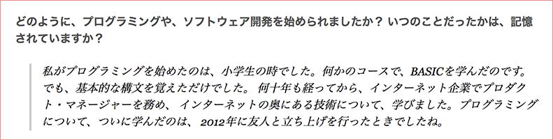
 - You can see the differences in font size and line height, even though both the English and Japanese paragraphs have the same CSS style.
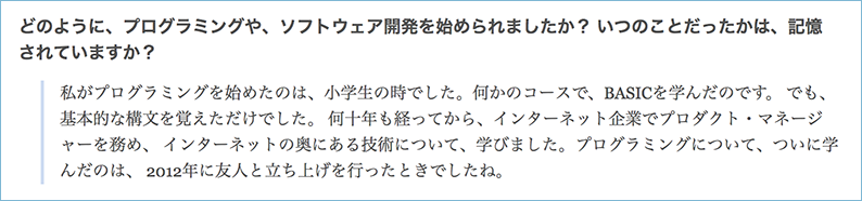
Use web safe font stack.
Web safe fonts are fonts that are pre-installed to many devices. The CSS font-family property should have several kinds of fonts as fallback, to ensure maximum compatibility between browsers. If the browser doesn't support the first font, it will go with the next one. To be safe, it would be better to set okay-looking fonts for Japanese like this:
font-family : 'ヒラギノ角ゴ ProN' , 'Hiragino Kaku Gothic ProN' , '游ゴシック' , '游ゴシック体' , YuGothic , 'Yu Gothic' , 'メイリオ' , Meiryo , 'MS ゴシック' , 'MS Gothic' , HiraKakuProN-W3 , 'TakaoExゴシック' , TakaoExGothic , 'MotoyaLCedar' , 'Droid Sans Japanese' , sans-serif;
“ヒラギノ角ゴ ProN” and “Hiragino Kaku Gothic ProN” are the same font. However, some browsers can't understand when it’s written in only Japanese or only English, so it is better to write it in both languages.
More about Japanese web font?
If you'd like to learn more about Japanese web fonts, you can check this post by Masaharu Hayataki.

Hyejeong Park
User Experience
No longer with XoxzoJoined November 2016. Major in Visual Design at Seoul National University. Previously worked as an UI designer for iOS app. Interested in both design and web development. Loves beautiful UI, clean Web, and Python/Django.